Mobile devices now account for over 60% of all web traffic. Yet, many websites still treat mobile as an afterthought, designing for desktop first and squeezing content into smaller screens. This outdated approach is costing businesses customers, conversions, and search rankings.
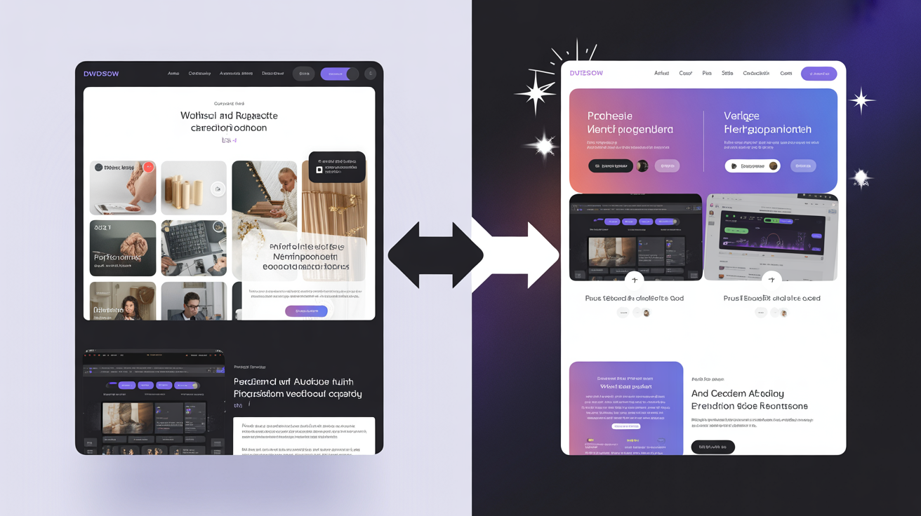
Mobile-first design flips this paradigm, starting with the mobile experience and progressively enhancing for larger screens. It's not just a trend—it's the new standard for modern web development.
What is Mobile-First Design?
Mobile-first is a design philosophy that prioritizes the mobile user experience from the very beginning of the design process.
Key Principles:
- Start small – Design for mobile screens first
- Progressive enhancement – Add features and complexity for larger screens
- Content prioritization – Focus on what's most important
- Touch-first interactions – Design for fingers, not cursors
- Performance focus – Mobile connections are often slower
Why Mobile-First Matters
The case for mobile-first design is overwhelming:
1. User Behavior Has Changed
- 60%+ of searches now happen on mobile devices
- Users spend more time on mobile than desktop
- Mobile commerce is growing faster than desktop e-commerce
- Younger demographics are mobile-only users
2. Google's Mobile-First Indexing
- Google primarily uses mobile version for ranking and indexing
- Poor mobile experience directly hurts SEO rankings
- Mobile-friendly sites get preferential treatment in mobile search
3. Better User Experience
- Forces content prioritization – Less clutter, clearer focus
- Faster loading – Lighter designs load quicker
- Simpler navigation – Streamlined for small screens works everywhere
4. Business Impact
- Higher conversion rates – Good mobile UX drives sales
- Reduced bounce rates – Users stay longer on mobile-optimized sites
- Competitive advantage – Many competitors still get this wrong
Core Elements of Mobile-First Design
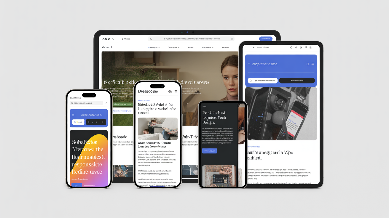
1. Responsive Layouts
Your design must fluidly adapt to any screen size.
- Flexible grids – Use percentages instead of fixed pixels
- Flexible images – Scale with their containers
- CSS media queries – Apply different styles for different screen sizes
- Mobile breakpoints – Define how your layout changes at specific widths
2. Touch-Friendly Interface
Design for fingers, not mouse cursors.
- Minimum tap target size: 44x44 pixels (Apple) or 48x48 pixels (Android)
- Adequate spacing – Prevent accidental taps
- Clear button states – Visual feedback for interactions
- Avoid hover-dependent features – Hover doesn't exist on touchscreens
- Thumb-friendly zones – Place important actions where thumbs naturally reach
3. Simplified Navigation
Small screens require streamlined navigation.
- Hamburger menus – Hide navigation until needed
- Priority navigation – Show most important links first
- Minimal levels – Avoid deep navigation hierarchies
- Bottom navigation bars – Easy thumb access for key actions
- Sticky headers – Keep navigation accessible while scrolling
4. Content Prioritization
Limited screen space forces tough choices.
- Essential content first – Show the most important information immediately
- Progressive disclosure – Reveal additional details on demand
- Single-column layouts – Easier to scan on small screens
- Concise copy – Get to the point faster
- Clear visual hierarchy – Help users scan quickly
5. Performance Optimization
Mobile users often have slower connections.
- Lightweight design – Minimize file sizes
- Lazy loading – Load content as needed
- Optimized images – Serve appropriate sizes for mobile
- Minimal dependencies – Fewer external resources
- Critical CSS inline – Faster initial render
6. Typography for Small Screens
Text must be readable without zooming.
- Minimum font size: 16px for body text
- Appropriate line height: 1.5 to 1.6 for readability
- Shorter line lengths – 50-75 characters per line
- Clear hierarchy – Distinct heading sizes
- Adequate contrast – Especially important in bright sunlight
Mobile-First Design Process
Phase 1: Research and Planning
- Analyze mobile analytics – Understand your mobile audience
- Identify user goals – What do mobile users want to accomplish?
- Audit competitor sites – Learn from others' successes and failures
- Define core features – What's absolutely essential?
Phase 2: Content Strategy
- Prioritize content – Rank by importance to mobile users
- Streamline copy – Make every word count
- Plan information architecture – Organize for easy mobile navigation
- Identify primary actions – What should users do?
Phase 3: Design
- Start with mobile wireframes – Sketch the basic structure
- Design mobile interface – Create detailed mobile designs
- Define breakpoints – Determine where layout changes
- Design for larger screens – Enhance the mobile design progressively
Phase 4: Development
- Code mobile styles first – Base CSS for mobile view
- Add media queries – Enhance for larger screens
- Test on real devices – Emulators aren't enough
- Optimize performance – Test on slow connections
Phase 5: Testing and Refinement
- Test on multiple devices – iPhone, Android, tablets
- Test on various browsers – Safari, Chrome, Firefox, etc.
- User testing – Watch real people use your mobile site
- Performance testing – Check loading speeds on 3G/4G
- Iterate based on feedback – Continuously improve
Common Mobile-First Mistakes to Avoid
1. Hiding Important Content
Don't assume mobile users want less information. They want the same content, just formatted better.
2. Tiny Touch Targets
Small buttons and links frustrate users and lead to mistakes.
3. Too Much Scrolling
Endless scrolling wears users out. Break content into manageable chunks.
4. Ignoring Landscape Orientation
Many users switch to landscape. Your design should handle it gracefully.
5. Blocking Content with Overlays
Intrusive pop-ups are especially annoying on mobile. Use them sparingly.
6. Requiring Pinch-to-Zoom
If users need to zoom to read or interact, your design has failed.
7. Forms That Don't Adapt
Mobile forms need larger inputs, appropriate keyboards, and minimal fields.
8. Performance Ignored
A beautiful design is useless if it takes 10 seconds to load on mobile.
Mobile-First Best Practices
Forms and Input
- Minimize fields – Only ask for what's absolutely necessary
- Use appropriate input types – Number keyboards for phone numbers, email keyboards for email
- Provide input masks – Show expected format
- Enable autofill – Make data entry easier
- Large, clear labels – Above or to the left of inputs
- Real-time validation – Provide immediate feedback
Images and Media
- Serve appropriately sized images – Don't waste bandwidth on unnecessarily large files
- Use responsive images – Different sizes for different screens
- Lazy load images – Load as users scroll
- Provide image placeholders – Show something while loading
- Optimize video playback – Consider data usage
Navigation Patterns
- Tab bars – For 3-5 primary sections
- Hamburger menu – For more complex navigation
- Priority+ – Show important items, hide others
- Bottom navigation – Easy thumb access
- Floating action button – For primary action
Testing Your Mobile Design
Device Testing
Test on actual devices, not just emulators:
- Various iPhone models – Different screen sizes
- Various Android devices – Multiple manufacturers
- Tablets – Both portrait and landscape
- Different OS versions – Old and new
Performance Testing
- Test on slow connections – Throttle your network
- Use Google PageSpeed Insights – Mobile-specific recommendations
- Test on actual 3G/4G – Not just WiFi
- Monitor real user metrics – Track actual performance in the wild
Usability Testing
- Watch users interact – See where they struggle
- Test in various contexts – Bright sunlight, one-handed use, etc.
- Gather feedback – Ask about pain points
- Track analytics – Monitor mobile user behavior
Mobile-First Tools and Resources
Design Tools
- Figma – Collaborative design with mobile preview
- Adobe XD – Prototyping and design
- Sketch – Popular among mobile designers
Development Frameworks
- Bootstrap – Mobile-first CSS framework
- Tailwind CSS – Utility-first, responsive by default
- Foundation – Another mobile-first framework
Testing Tools
- Chrome DevTools – Device emulation
- BrowserStack – Test on real devices remotely
- Google Mobile-Friendly Test – Quick compatibility check
The Future of Mobile-First
Mobile-first is evolving into "mobile-only" for many users. As we look ahead:
- 5G adoption – Faster mobile connections blur the line between mobile and desktop performance
- PWAs (Progressive Web Apps) – App-like experiences in browsers
- Voice interfaces – Voice search and interactions
- Foldable devices – New screen sizes to consider
- Wearables – Even smaller screens to design for
Getting Started with Mobile-First
Immediate Action Steps:
- ☐ Analyze your mobile traffic and user behavior
- ☐ Test your current site on multiple mobile devices
- ☐ Identify mobile-specific pain points
- ☐ Prioritize mobile user goals
- ☐ Create mobile wireframes for key pages
- ☐ Implement responsive design if you haven't
- ☐ Optimize mobile performance
- ☐ Test, gather feedback, iterate
Need Help Going Mobile-First?
At Gizseo, every website we build is mobile-first by default. We don't treat mobile as an afterthought—it's our starting point.
Our sites:
- ✓ Score 90+ on mobile PageSpeed
- ✓ Pass Google's Mobile-Friendly Test
- ✓ Provide exceptional user experience across all devices
- ✓ Convert mobile visitors into customers
Ready to create a truly mobile-first website? Contact us for a free consultation and learn how we can help you succeed in the mobile-first world.