Your website is often the first—and sometimes only—interaction potential customers have with your business. A well-designed site builds trust, guides visitors toward action, and drives conversions. But design mistakes, even seemingly small ones, can send visitors running to your competitors.
After years of analyzing websites and helping businesses improve their online presence, we've identified 5 common design mistakes that consistently cost businesses customers—and how to fix them.
1. Poor Navigation and Information Architecture
The Problem: Visitors can't find what they're looking for, leading to frustration and abandonment.
Common Navigation Mistakes:
- Overly complex menu structures – Too many options overwhelm users
- Unclear labels – Creative names that confuse instead of clarify
- Hidden navigation – Important pages buried deep in the site structure
- Inconsistent navigation – Menu changes between pages
- No search function – Especially problematic for larger sites
- Poor mobile navigation – Tiny links, difficult-to-tap buttons
The Impact:
- High bounce rates – Users leave when they can't find what they need
- Lost sales – Potential customers give up before converting
- Poor SEO – Search engines struggle to crawl poorly organized sites
- Increased support costs – More people calling or emailing with basic questions
The Fix:
- Keep it simple – Aim for 5-7 main navigation items
- Use clear, descriptive labels – "Services" not "What We Do"
- Follow conventions – Logo links to homepage, contact in top right, etc.
- Implement breadcrumbs – Help users understand where they are
- Add search functionality – Especially for content-heavy sites
- Test with real users – Watch where they struggle to find things
- Use a logical hierarchy – Group related content together
2. Slow Loading Speed
The Problem: Your site takes too long to load, and users don't wait around.
Speed Killers:
- Unoptimized images – Massive file sizes that weren't compressed
- Too many plugins – Each adds overhead
- Poor hosting – Cheap hosting can't handle your traffic
- Unminified code – Bloated CSS and JavaScript
- Lack of caching – Generating every page from scratch
- External resources – Slow third-party scripts
The Impact:
- 53% of mobile users abandon sites that take longer than 3 seconds to load
- Lower search rankings – Google factors speed into rankings
- Reduced conversions – Every second of delay decreases conversions
- Poor user experience – Frustration leads to negative brand perception
The Fix:
- Optimize images – Compress before uploading, use modern formats like WebP
- Enable caching – Store static resources in users' browsers
- Use a CDN – Distribute content globally for faster delivery
- Minify code – Remove unnecessary characters from CSS/JS
- Choose quality hosting – Don't cheap out here
- Lazy load images – Load images as users scroll
- Monitor regularly – Use tools like PageSpeed Insights
3. Not Mobile-Optimized
The Problem: Your site looks great on desktop but is unusable on mobile devices.
Mobile Design Failures:
- Non-responsive design – Requires zooming and horizontal scrolling
- Tiny text – Unreadable without zooming
- Touch targets too small – Buttons and links difficult to tap
- Pop-ups blocking content – Especially frustrating on small screens
- Flash or unsupported features – Not compatible with mobile devices
- Slow mobile performance – Even worse on cellular connections
The Impact:
- Lost mobile traffic – 60%+ of users are on mobile
- Poor mobile rankings – Google uses mobile-first indexing
- Reduced conversions – Mobile users bounce before converting
- Competitive disadvantage – Competitors with mobile-friendly sites win
The Fix:
- Responsive design – Adapt to all screen sizes automatically
- Mobile-first approach – Design for mobile, enhance for desktop
- Large, tappable buttons – At least 44x44 pixels
- Readable font sizes – Minimum 16px for body text
- Optimize for touch – Design for fingers, not cursors
- Test on real devices – Multiple phones and tablets
- Simplify mobile navigation – Hamburger menus, priority navigation
4. Weak or Confusing Calls-to-Action (CTAs)
The Problem: Visitors don't know what action you want them to take, or CTAs don't stand out.
CTA Mistakes:
- No clear CTA – Visitors left wondering what to do next
- Too many CTAs – Overwhelming and diluting focus
- Weak copy – "Submit" or "Click here" instead of compelling language
- Poor visibility – CTAs that blend into the background
- Wrong placement – Hidden below the fold or in unexpected locations
- Conflicting CTAs – Multiple competing actions confuse users
The Impact:
- Lost conversions – Visitors don't take desired actions
- Wasted traffic – Failing to capitalize on visitor interest
- Unclear value proposition – Users don't understand the benefit
- Lower ROI – Marketing efforts don't translate to results
The Fix:
- Make CTAs prominent – Use contrasting colors, adequate size
- Use action-oriented copy – "Get Your Free Quote" instead of "Submit"
- Create urgency – "Start Your Free Trial Today"
- One primary CTA per page – Guide users to the most important action
- Strategic placement – Above the fold, and repeated where appropriate
- Clear value proposition – Explain what happens when they click
- A/B test – Experiment with copy, color, placement
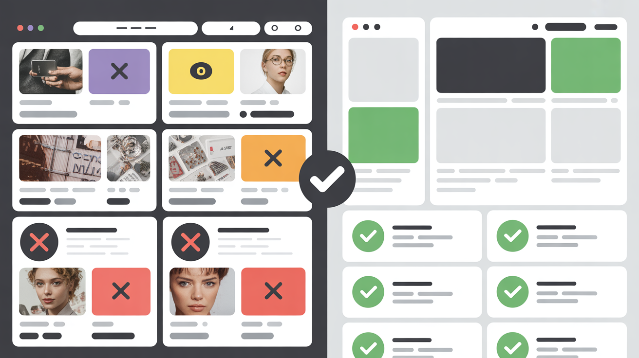
5. Cluttered, Overwhelming Design
The Problem: Too much information, too many elements, and no clear visual hierarchy.
Clutter Culprits:
- Too much text – Walls of text that nobody reads
- Excessive visuals – Competing images and graphics
- Multiple fonts and colors – Inconsistent, chaotic appearance
- Pop-ups and banners – Intrusive elements everywhere
- No whitespace – Every inch filled with something
- Animated elements – Distracting movements everywhere
- Too many ads – Obscuring actual content
The Impact:
- Cognitive overload – Visitors feel overwhelmed and leave
- Poor comprehension – Users can't absorb your message
- Reduced conversions – Too many distractions from the goal
- Unprofessional appearance – Cluttered designs look dated and untrustworthy
The Fix:
- Embrace whitespace – Give elements room to breathe
- Clear visual hierarchy – Guide eyes to important information
- Limit font choices – Maximum 2-3 fonts
- Consistent color palette – 2-3 primary colors
- Break up text – Use headings, bullet points, short paragraphs
- Remove unnecessary elements – If it doesn't serve a purpose, delete it
- Prioritize content – Show the most important information first
- Use progressive disclosure – Reveal details as needed
Bonus Mistake: Ignoring Accessibility
While not one of the top 5, accessibility issues are increasingly costly:
Common Accessibility Mistakes:
- Poor color contrast – Text that's hard to read
- Missing alt text – Screen readers can't describe images
- Keyboard navigation issues – Can't navigate without a mouse
- No captions on videos – Excluding deaf users
- Unclear form labels – Difficult for screen readers
Why It Matters:
- 15% of the population has disabilities – That's a significant market
- Legal requirements – ADA compliance is legally mandated for many businesses
- Better SEO – Accessible sites rank better
- Improved usability for everyone – Accessible design benefits all users
How to Audit Your Website
Follow this process to identify design mistakes on your site:
Step 1: Technical Audit
- Use Google PageSpeed Insights for performance
- Use Google Mobile-Friendly Test
- Check browser compatibility
- Test on multiple devices
Step 2: User Experience Audit
- Navigate your site as a first-time visitor
- Try to complete key tasks (find info, make purchase, contact you)
- Watch others use your site
- Review heatmaps and session recordings
Step 3: Content Audit
- Is information clear and easy to find?
- Are CTAs obvious and compelling?
- Is the design cluttered or clean?
- Does the design support your brand?
Step 4: Analytics Review
- Check bounce rates
- Review conversion funnels
- Identify exit pages
- Analyze mobile vs. desktop performance
Taking Action
Don't try to fix everything at once. Prioritize based on impact:
High Priority (Fix Immediately):
- Mobile responsiveness issues
- Severe performance problems
- Broken navigation
Medium Priority (Fix Soon):
- Weak CTAs
- Design clutter
- Minor speed optimizations
Lower Priority (Address Over Time):
- Visual design updates
- Content improvements
- Advanced features
Prevention: Design It Right From the Start
The best way to avoid these mistakes is to design properly from the beginning:
- User-centered design – Focus on visitor needs, not just aesthetics
- Mobile-first approach – Design for small screens first
- Performance budget – Set speed goals from the start
- Clear goals – Know what you want users to do
- Regular testing – Continuous improvement, not one-time design
- Professional development – Work with experienced designers
The Bottom Line
These 5 common design mistakes are costing businesses thousands in lost conversions every month. The good news? They're all fixable.
Whether you tackle these issues yourself or work with professionals, the important thing is to take action. Your website is too important to leave broken.
Need Help Fixing Your Website?
At Gizseo, we specialize in building websites that avoid these pitfalls from the start. Every site we create is:
- ✓ Fast and optimized for performance
- ✓ Fully mobile-responsive
- ✓ Designed with clear navigation and CTAs
- ✓ Clean, professional, and user-focused
- ✓ Built for conversions, not just looks
Want a website that converts visitors into customers? Contact us for a free consultation and learn how we can help you avoid these costly mistakes.